by Christine Leuthold
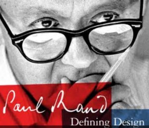
A logo is a visual representation of a company that can speak volumes. Paul Rand designed some of the great ones, including FEDEX, ABC, UPS and many more. While it is an artistic expression, it is also strategic as well.
Often the best way to understand an end-result is to go behind the scenes and start at the beginning. Here is the process we used to create our logo. This is the type of analytical thinking we would use in evaluating yours, whether it is established or still in the works.

The Idea
C Insight Group is a company that connects core identity to branding and leverages the connection across organizations and beyond. Our approach centers on linking together systems, departments, resources and networks to promote growth internally and externally. Our logo is made up of words, fonts, an open circle, a dot and colors. So where did all this dot-and-circle thinking come from?
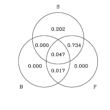
The catalyst was a Venn diagram taken from a report about systems integration. It was an almost perfect expression of our approach and process. Almost, bei ng the key word. These grey circles intersecting each other create a central rounded triangle. This was point of origin of a creative, collaborative and strategic journey that would take several weeks to refine. As a result of this process, our own core identity became even stronger.
The Words and The Sounds
- The C stands for Christine, the founder and creative director, whose extensive branding experience equips her with a unique approach and Insight that is applied to every project and every client.
- The I stands for Identity, which is the defining nature of any idea, person, organization or initiative.
- Taken together, the C + I = Core Identity, the all-important point of origin.
- And finally, group represents our highly collaborative process.
- And G also stands for Growth, which is really what it’s all about.
… And since we’re talking abc’s, this logo is not only about how it looks, it’s also about how it sounds:
- C is pronounced “see”, as in vision… which leads to insight, which is what we bring to the table.
- I sounds like “eye”, the tool that enables observation, learning and discernment… which leads to insight.
- And G, well perhaps because it’s what we often hear from our clients, “Gee, we didn’t realize that we had overlooked all these opportunities for growth right here!”
- The word group was actually a bit of serendipity. In our attempts to find a .com url, we needed one more word to add to C Insight. It was a blessing in disguise because CInsightGroup.com was available. Not only did it get us our .com, but it also perfectly expresses our ability to tap into our vast network of resources and industry friends to create outcomes collaboratively.
The Image
- The orange dot represents the catalyst that sparks the creation of the brand to begin the process of connecting that brand to the rest of the organization and beyond. Though convention dictates how and where i’s are dotted, we intentionally position our dot in the middle of the i, situated at the center of the C, an open circle that represents the brand.
- The text fonts were chosen very deliberately. The font used for “insight” expresses the streamlined, architectural clarity that is a critical element of any well-functioning initiative. For “group”, the choice was to make it more personal, going beyond font families, using Christine’s actual handwriting. This is a reflection of the humanity that makes something uniquely branded. The font styles provide aesthetic counterbalance.
- As for the color choice, in color theory, orange and blue are complementary colors. Side-by-side, they each other. The orange pops the blue, and vise-versa. Like the bundle of sticks in Aesop’s fable referenced on the home page, together, their impact is greater than on their own. That’s the kind of impact that our clients can experience within their organization and beyond.
The Evolution of the Visual
Core identity and brand can either reinforce a company’s messaging and operations — or undermine its growth entirely. When identity and brand are fully integrated, growth is inevitable.
- In the next iteration logo, the four outer circles were connected to the central C. They represented the connection of systems and networks to the b
 rand, which emanates from the core identity. Aligned growth happens when systems are integrated across day-to-day operations. (Now consider how much weaker this image would be with the circles disconnected from the C… the structure and message diminish.)
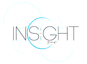
- As the logo evolved, we introduced the dot, a blue hand-hewn C, and transformed the circles into subtle watermarks, not as bold as the C, which remains dominant.
- In this expanded version, watermark circles connect to the central, open circle that is the brand, the letter C. At a closer glance, the intersecting circles come together to form a diamond that frames the orange dot.
- And finally, we had a visual expression of the elements of C Insight Group’s own core identity. The watermark circles were removed for the static representation of the logo that you see below and on our business cards.
- The dynamic logo, incorporating the watermark circles appears on our home page, and is in the process of become animated. Everything that emanates from the center, where seemingly unrelated disciplines, departments, programs, resources and networks fortify each other, while the point, which in scientific circles is referred to as the “zero dimension”* is at the heart of it all.
- but pared it back to the essentials, it’s all about the dot, the C and the text. Our core identity. Our logo.
… and as for the zero dimension, well, that’s another story.